
Build polished Blazor apps without rebuilding the UI stack
Components, utilities, theming, and commercial support in one source-available foundation.
Blazorise gives product teams a complete UI layer for complex business applications: accessible components, responsive layouts, validation, localization, charts, data grids, and provider flexibility across the CSS frameworks your team already knows.
7+
CSS providers
Bootstrap, Bulma, Material, AntDesign, Fluent UI, Tailwind, and more.
100+
UI components
A broad component set for forms, grids, charts, layout, navigation, and feedback.
1 API
Consistent model
Fluent utilities and consistent APIs keep teams moving without one-off UI plumbing.
A UI platform for product-grade Blazor applications
Blazorise is built for teams that need more than isolated controls. It gives you consistent primitives for layout, forms, data, styling, and production workflows.
Everything a serious Blazor UI needs
Core capabilities stay consistent across providers, so teams can standardize how applications are built and maintained.
Provider flexibility
Choose the CSS framework that fits your product and keep the same Blazorise component model.
Data-heavy workflows
Build tables, grids, lists, filters, validation, and editing flows for operational applications.
Responsive layouts
Compose desktop and mobile experiences with framework-backed layout and utility primitives.
Theme control
Align colors, spacing, and visual treatment with your product or customer design system.
Validation and forms
Use built-in validation patterns across common input types and complex forms.
Localization
Ship translated UI with Blazorise localization support and provider-independent components.
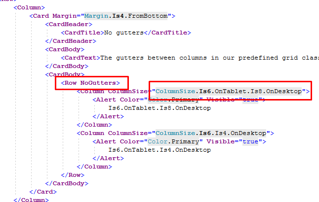
Keep markup expressive without losing control
Use Blazorise utilities for responsive layout, spacing, display, sizing, borders, shadows, typography, and flex behavior directly from Razor. You get predictable UI composition without scattering one-off CSS across the application.
Control layout behavior through breakpoints and fluent utility parameters.
Keep common styling decisions close to the component markup.
Use shared utility APIs instead of inventing local classes for routine layout work.
Apply the same spacing, display, and sizing language across your app.
Source available, commercially supported
Start with the Community License, inspect the source, and move to commercial support when your team needs private assistance, licensing coverage, and delivery confidence.